The kitchen serves as the vibrant core of any home-a gathering spot where families connect, stories unfold, and lasting memories are crafted. Yet, many homeowners underestimate the remarkable impact that a fresh coat of paint can have in revitalizing this vital area. Choosing the right hue can dramatically transform your kitchen’s ambiance without the expense and hassle of a full remodel.
Whether your goal is to illuminate a compact kitchen, inject boldness into a contemporary design, or cultivate a warm, rustic atmosphere, paint offers a versatile and cost-effective solution. From cabinetry and walls to islands and trim, a carefully selected color palette can rejuvenate worn spaces and accentuate your kitchen’s standout features.
This comprehensive guide presents 22 inspiring kitchen paint ideas, spanning from enduring classics to daring choices, complete with practical advice on how to adapt these concepts to your home. You’ll learn how various shades influence the kitchen’s mood and utility, alongside expert tips for pinpointing the ideal color tailored to your unique environment.
Discover how a simple paintbrush can become your most powerful ally in reinventing your kitchen!
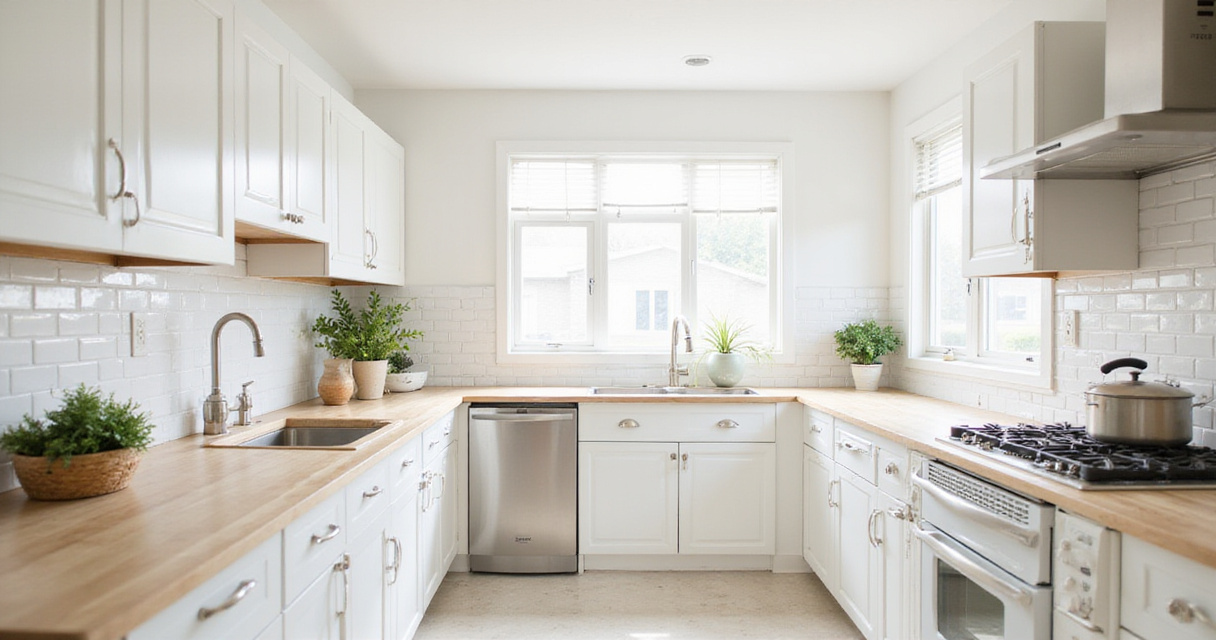
1. Bright White: Elegant and Expansive Ambiance
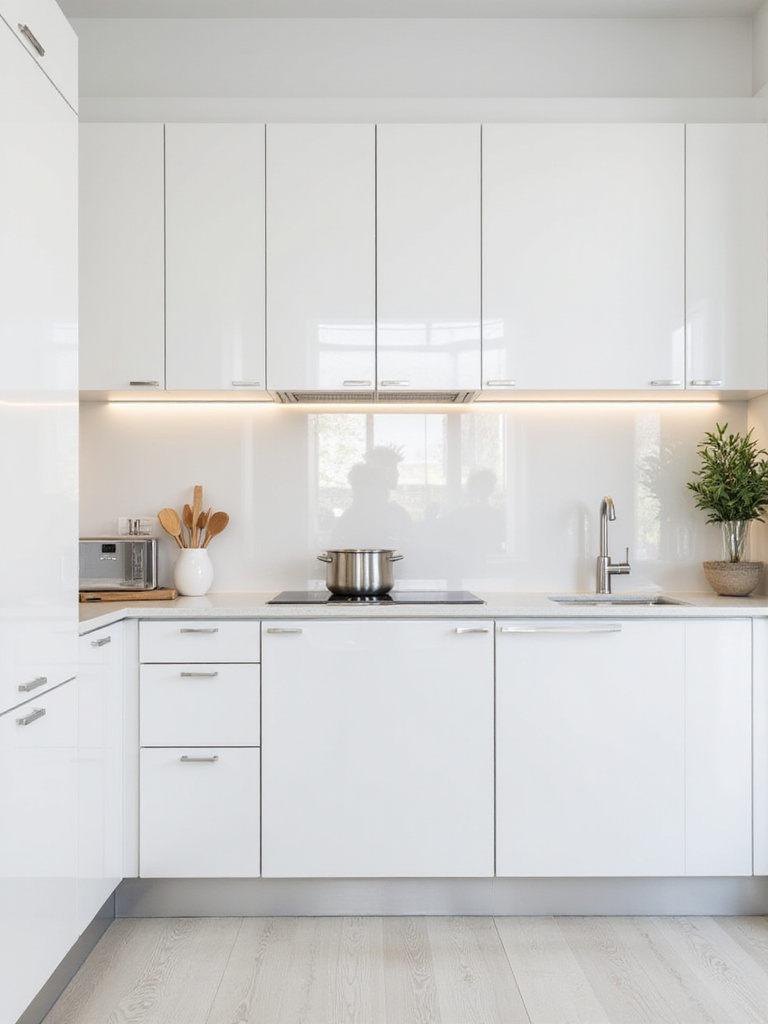
White remains a perennial favorite for kitchens, and it’s easy to see why. This crisp, luminous shade instantly amplifies the sense of space by reflecting light, making even the smallest kitchens feel open and welcoming. White surfaces create a pristine backdrop that enhances the visibility of other design elements.
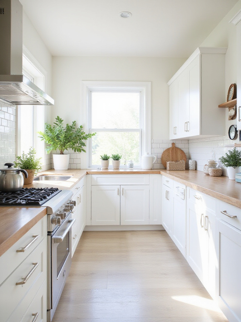
One of white’s greatest strengths is its ability to showcase your kitchen’s accessories-be it elegant hardware, a vibrant backsplash, or colorful cookware collections. Additionally, white walls and cabinets provide a flexible canvas for seasonal décor updates without the need for repainting.
To avoid monotony, experiment with layering textures such as beadboard paneling, glossy subway tiles, and matte cabinetry finishes. This interplay adds dimension and interest while preserving a cohesive, clean aesthetic.
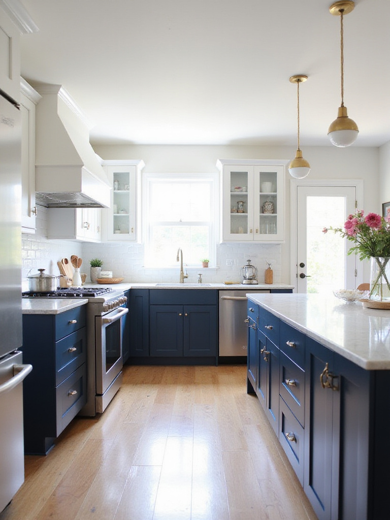
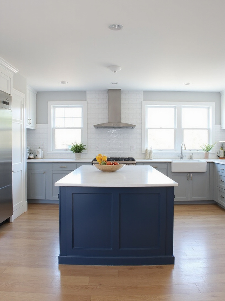
2. Rich Navy Blue: Sophistication Meets Functionality
Navy blue has emerged as a top contender for those seeking a kitchen color that exudes both elegance and depth. This deep, saturated tone elevates any kitchen, infusing it with a refined yet contemporary flair. It’s a shade that can turn a simple kitchen into a stylish showpiece.
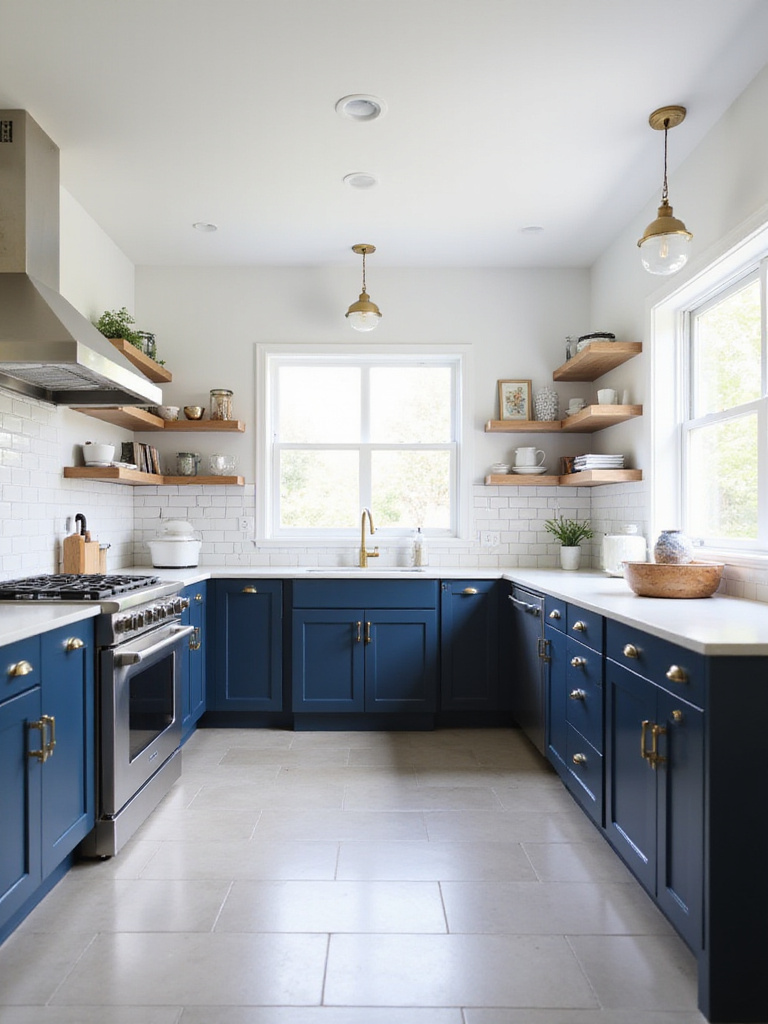
Beyond aesthetics, navy blue is practical-it conceals fingerprints and cooking smudges better than lighter hues, reducing the need for constant cleaning. Pairing navy cabinets with white countertops or backsplashes creates striking contrast, highlighting both elements beautifully.
Imagine navy lower cabinets combined with crisp white uppers and gleaming brass fixtures-this combination balances timelessness with trendiness, delivering a sophisticated kitchen that commands attention without overwhelming the senses.
3. Natural Greens: Calming and Invigorating Tones
Earthy green shades have a unique ability to reconnect us with nature, bringing a soothing and revitalizing atmosphere into the kitchen. Whether you opt for soft sage, deep olive, or muted moss, these colors foster a serene environment ideal for the heart of the home.
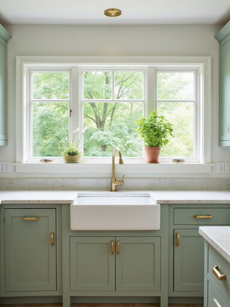
Green’s versatility shines in its compatibility with various materials-it complements wooden accents, enhances stainless steel appliances, and pairs well with both light and dark stone surfaces. Moreover, green hues are associated with wellness and vitality, making them perfect for spaces dedicated to nourishing meals.
If committing to a full green kitchen feels daunting, consider starting with an accent wall or painting the kitchen island to introduce this refreshing color gradually.
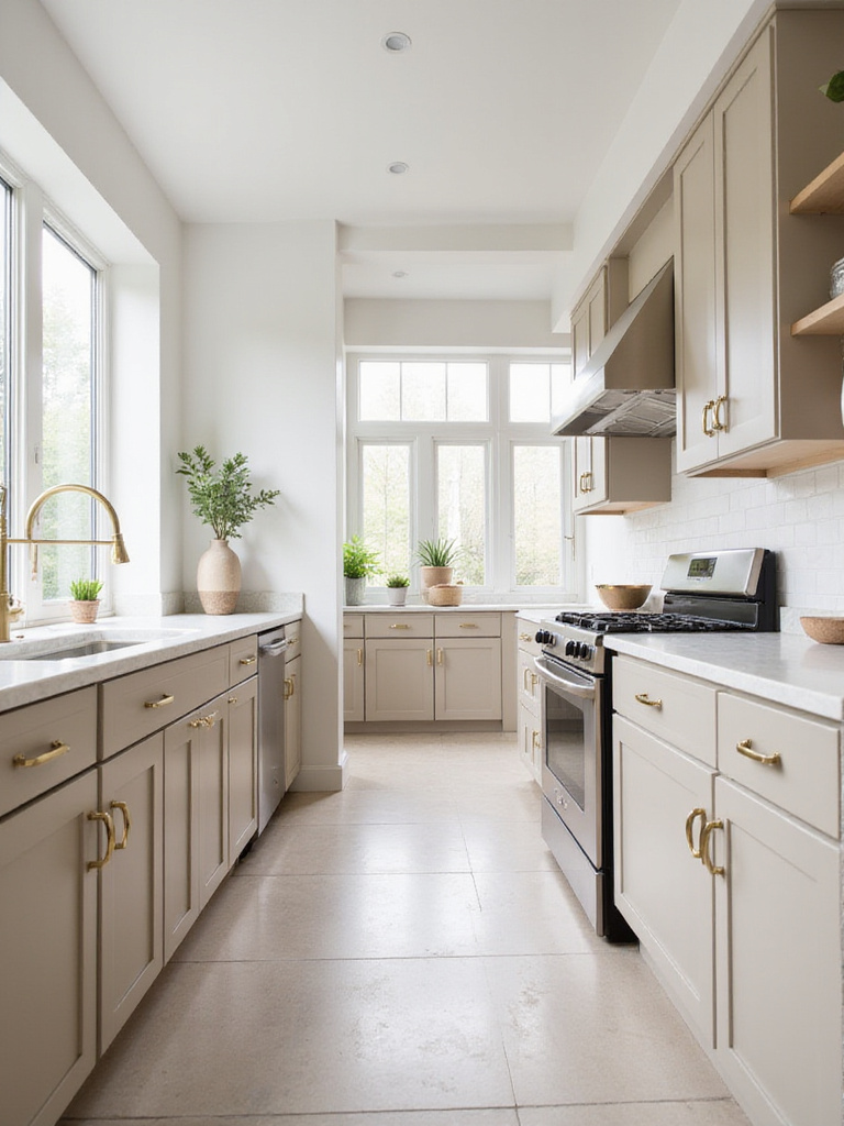
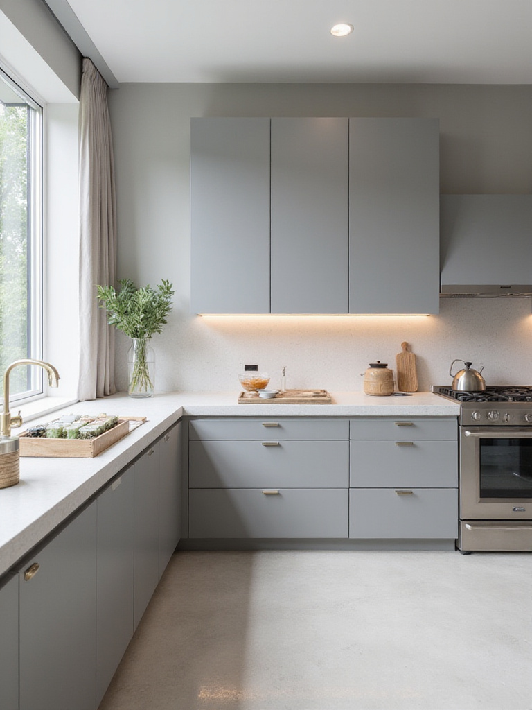
4. Cozy Warm Gray: A Modern Neutral with Depth
Warm gray tones offer a chameleon-like quality, adapting gracefully to varying light and design elements. Unlike cooler grays that can feel sterile, warm grays carry subtle undertones-beige, taupe, or even soft lavender-that create a welcoming yet sophisticated ambiance.
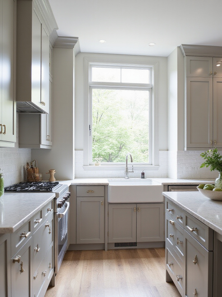
This shade is ideal for those seeking a contemporary look without the starkness of white or the boldness of vivid colors. Warm gray conceals minor wall imperfections and pairs effortlessly with a wide range of cabinetry, countertops, and flooring options.
Choosing the perfect warm gray requires testing samples in your kitchen’s lighting, as undertones can shift dramatically throughout the day.
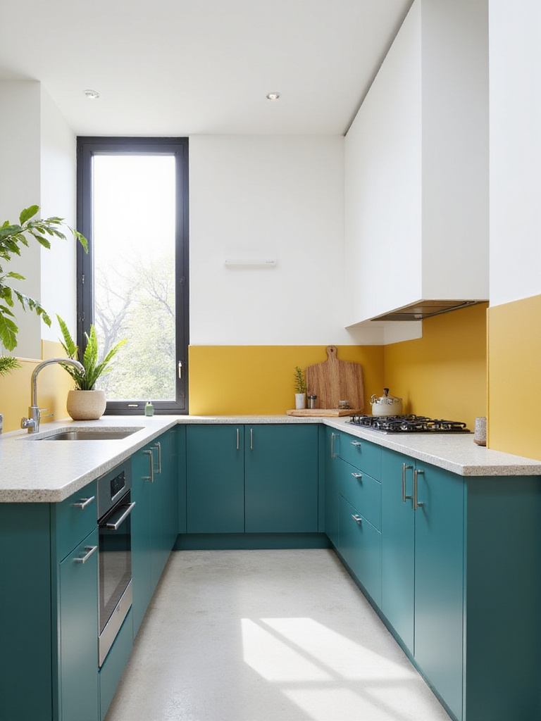
5. Cheerful Yellow Accents: Brightness and Vitality
Yellow injects a burst of sunshine into your kitchen, instantly uplifting the space’s energy and mood. Even subtle applications of yellow can transform a dull kitchen into a lively, inviting area. Soft buttery or creamy yellows add warmth without overwhelming the senses.
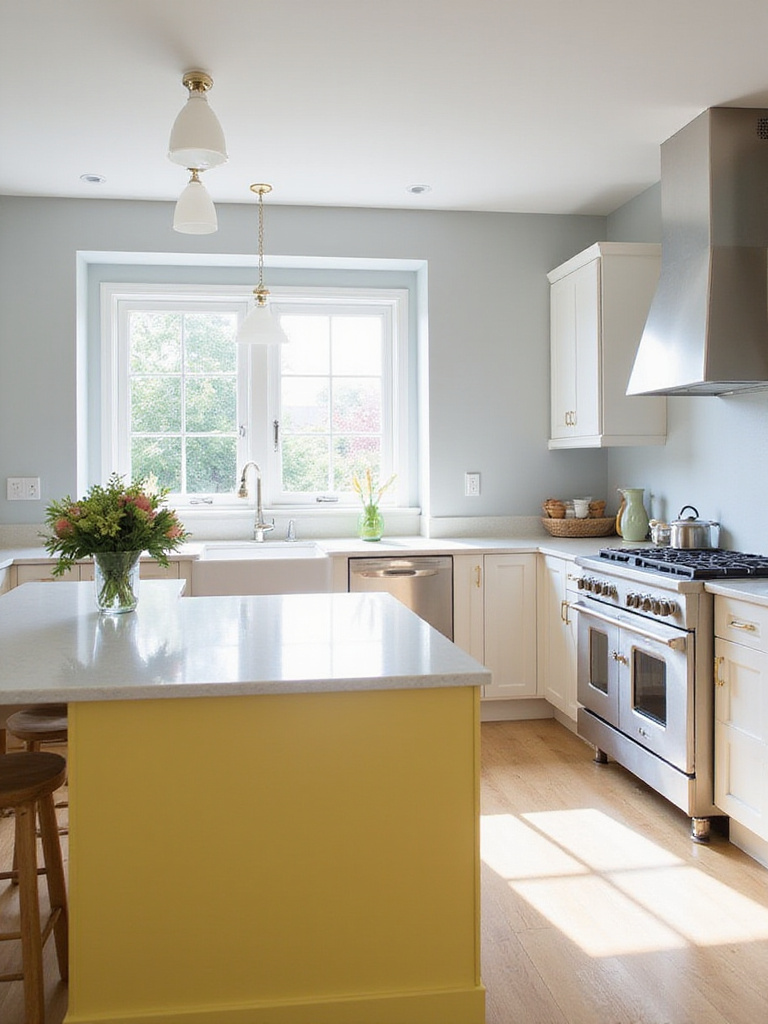
Strategic use of yellow-such as a painted island, lower cabinets, or a backsplash-creates joyful focal points that balance well with neutral surroundings. This approach allows you to enjoy the vibrancy of yellow without it becoming overpowering.
“Yellow is capable of charming God.” – Vincent Van Gogh
One memorable project involved painting a client’s kitchen island a soft buttercream yellow, which transformed the entire space and became a beloved conversation starter among guests.
6. Soft Pastels: Airy and Serene Retreats
Pastel shades-such as gentle blues, mint greens, blush pinks, and lavender-offer a subtle yet distinctive way to infuse personality into your kitchen. These hues create a light, airy atmosphere that feels refreshing and calming.
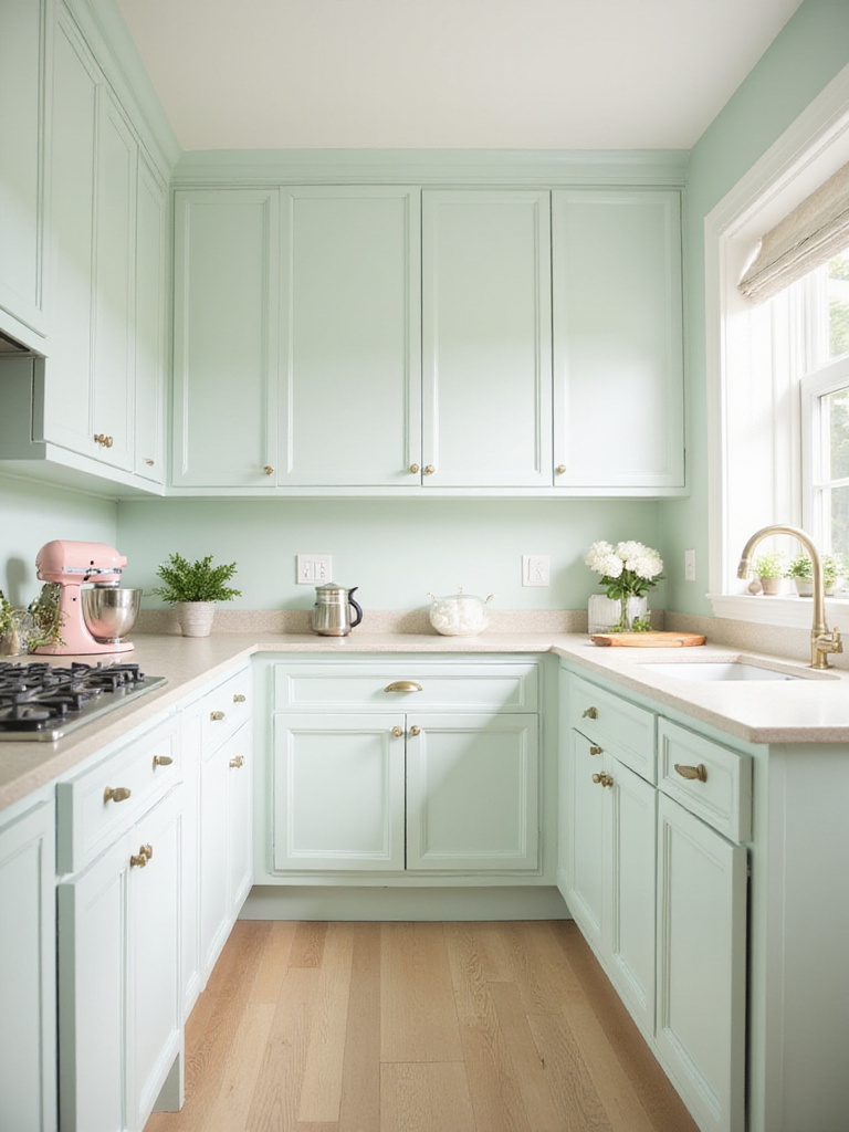
Pastels thrive in kitchens with abundant natural light, where their subtle nuances can be fully appreciated. They also help mask minor imperfections, making them practical for busy households.
To ensure harmony, coordinate your pastel choice with existing countertops, backsplashes, and flooring, considering undertones to achieve a cohesive and intentional look.
7. Striking Black Cabinets: Bold Elegance and Drama
Black cabinetry exudes a sense of luxury and confidence, anchoring the kitchen with dramatic sophistication. This timeless choice adds depth and a modern edge, making a powerful design statement.
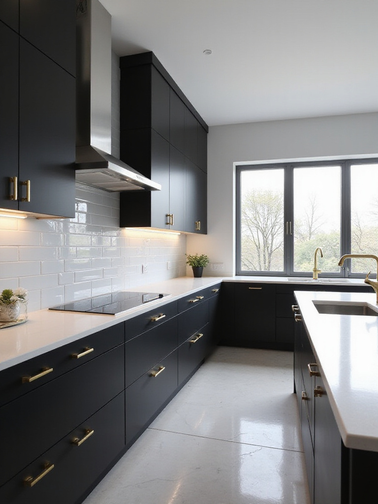
Black cabinets are surprisingly practical, concealing smudges and cooking residues better than lighter colors. They also provide a stunning backdrop for hardware, turning simple knobs and pulls into eye-catching accents.
One client’s initial hesitation about dark cabinetry was overcome by pairing black lower cabinets with white uppers, resulting in a kitchen that felt larger and more thoughtfully designed due to the striking contrast.
8. Two-Tone Cabinets: Contemporary Contrast and Visual Depth
For those seeking a kitchen that’s more dynamic than a single color but less intense than full bold hues, two-tone cabinetry offers an elegant solution. This style introduces architectural interest and a custom feel that elevates the entire space.
Successful two-tone kitchens often feature lighter colors on upper cabinets and darker shades below, creating balance and the illusion of higher ceilings. Popular pairings include white with navy, cream with sage, or light gray with charcoal.
- Light upper cabinets with dark lower cabinets enhance spatial perception
- Contrasting islands serve as eye-catching focal points
- Shades within the same color family add subtle sophistication
- Complementary colors make bold yet harmonious statements
This approach is flexible and easy to update-repainting one section refreshes the look without a full overhaul.
9. Chalkboard Walls: Functional and Playful Surfaces
Chalkboard paint walls are a fantastic addition for families and cooking enthusiasts alike, combining utility with style. These writable surfaces serve as hubs for grocery lists, meal plans, or creative doodling, all while adding a unique design element.
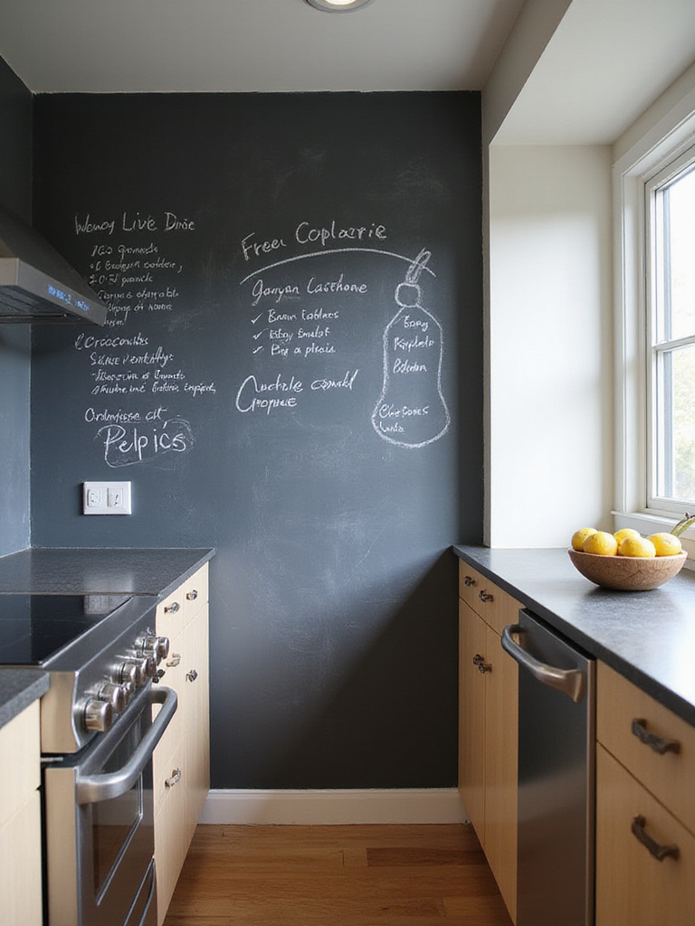
Ideal placement is near the refrigerator or pantry for easy access. Opt for authentic chalkboard paint to ensure smooth writing and erasing. Styled thoughtfully, chalkboard walls add an industrial-chic vibe without feeling like a classroom.
Pairing a charcoal chalkboard wall with white cabinetry and warm wood accents creates a modern farmhouse aesthetic that’s both practical and inviting.
10. Farmhouse Neutrals: Warmth and Welcoming Charm
Soft creams, gentle beiges, and warm taupes form the foundation of farmhouse-inspired kitchens. These hues create a cozy, lived-in feel that’s both fresh and timeless, perfectly complementing rustic design elements.
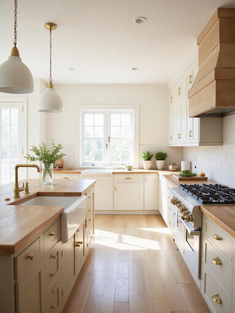
The subtle warmth of these colors enhances natural materials like exposed wood beams, butcher block counters, and ceramic sinks, creating a soft glow that invites lingering conversations and shared meals.
These tones don’t just look appealing-they foster a welcoming atmosphere that encourages connection and comfort.
11. Coastal Blues and Greens: Serene and Refreshing Vibes
Inspired by the sea, coastal blues and greens bring a tranquil, breezy feel to kitchens. These muted, slightly desaturated shades evoke the calmness of ocean horizons and weathered sea glass, offering a peaceful retreat from daily stress.
These colors work especially well in busy households seeking a calming sanctuary. Pairing seafoam green cabinets with pale blue walls can create a soothing environment that positively impacts mood and wellbeing.
12. Greige Neutral: The Perfect Blend of Gray and Beige
Greige, a harmonious fusion of gray and beige, is a versatile neutral that adapts to various lighting and design styles. It offers warmth without feeling dated and sophistication without coldness, making it an excellent backdrop for diverse kitchen elements.
Greige’s forgiving nature helps conceal imperfections better than stark white or pure gray, and it pairs beautifully with mixed metal finishes, ideal for kitchens featuring varied hardware and appliances.
While greige may not always photograph as strikingly as white, it offers a more livable, cozy atmosphere that withstands the test of time.
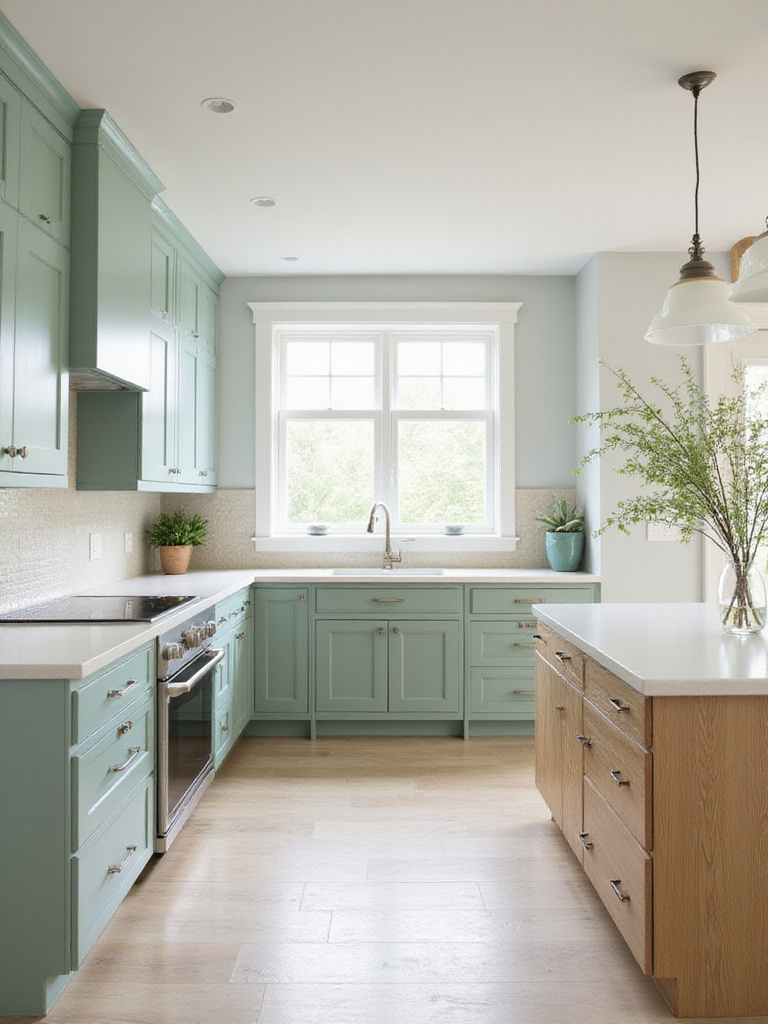
13. Sage Green: Versatile and Soothing
Sage green is a favorite for its muted, earthy tone that brings a sense of calm and organic beauty indoors. This shade works well on cabinets, walls, and islands, offering a timeless look that adapts to different lighting conditions.
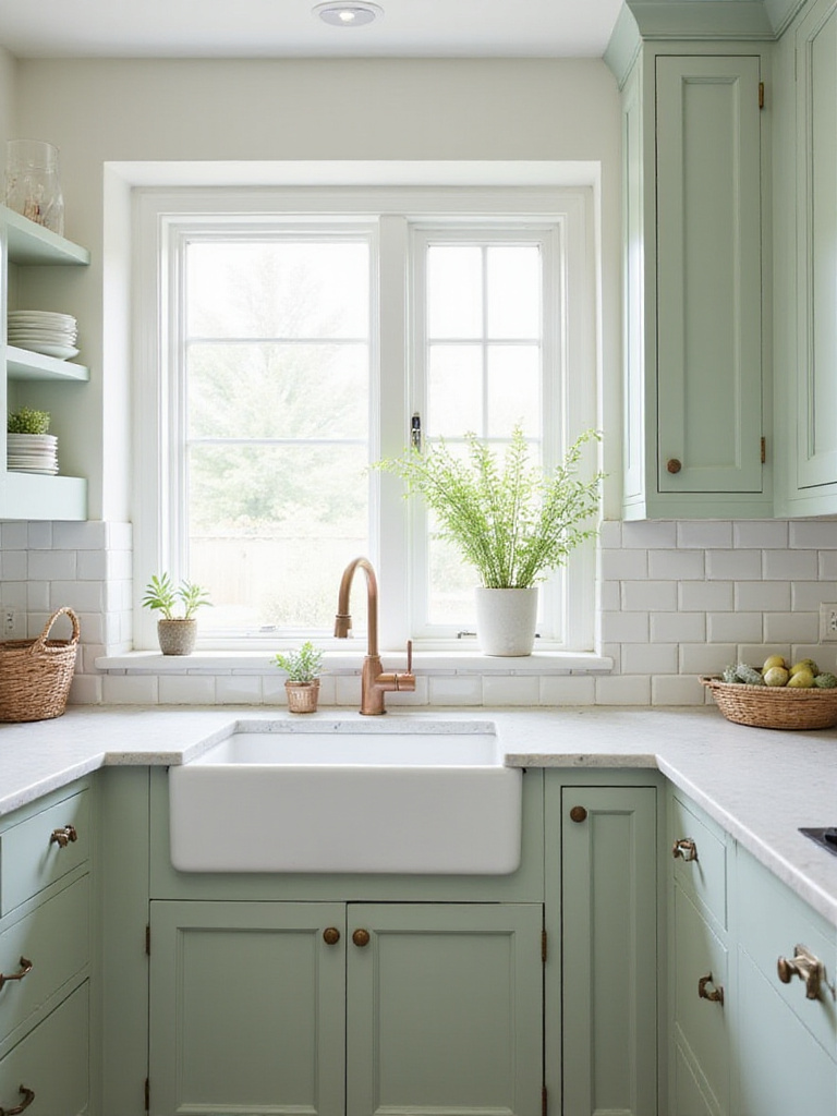
Sage pairs beautifully with natural wood, marble, black accents, and warm metals like brass or copper, making it ideal for open-concept homes. Testing various shades in your kitchen’s lighting is crucial to find the perfect balance between fresh and cozy.
14. Terracotta: Earthy Warmth with Mediterranean Charm
Terracotta hues evoke the sun-drenched warmth of Mediterranean landscapes, infusing kitchens with a welcoming, rustic character. These reddish-brown tones create an inviting atmosphere that encourages gathering and conviviality.
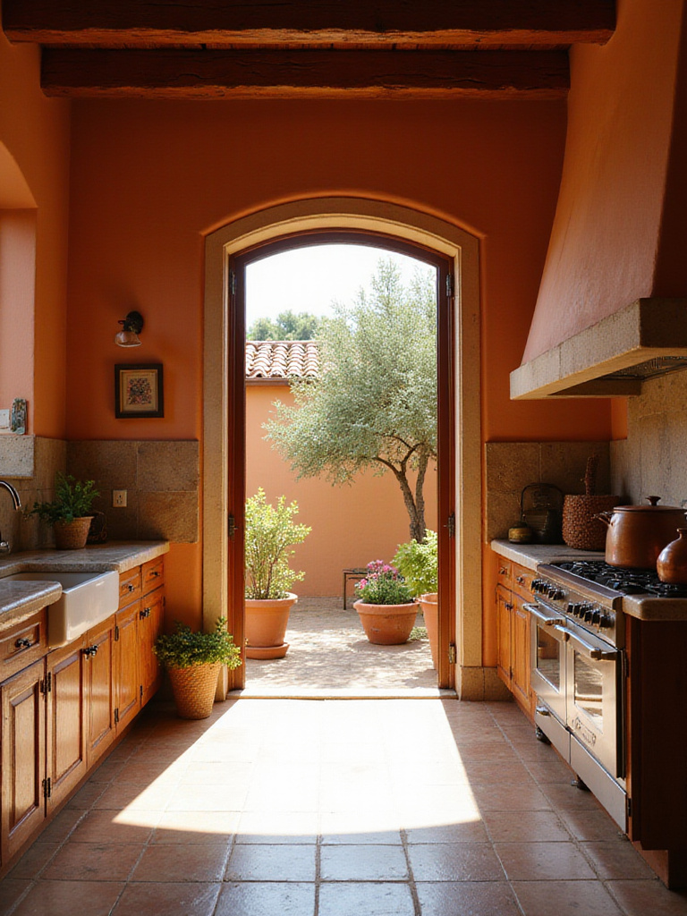
Terracotta is especially effective in kitchens with limited natural light, as its warm undertones counterbalance cooler lighting. It pairs naturally with wood, stone, and artisanal tiles, adding depth and soul to your kitchen.
If a full terracotta palette feels bold, try incorporating it as an accent wall or painted furniture piece for a subtle yet impactful touch.
15. Metallic Accents: Subtle Luxury and Dimension
Incorporating metallic paint accents introduces a hint of glamour and sophistication to your kitchen. Instead of overwhelming the space, use metallic finishes sparingly-such as inside cabinet interiors, on range hoods, or ceiling details-to add sparkle and depth.
- Highlight ceiling medallions or coffered ceilings with metallic paint
- Paint the interiors of glass-front cabinets in gold or copper tones
- Use silver leaf on range hoods for a statement piece
- Add subtle shimmer to the backs of open shelving
These reflective touches amplify natural light and create dynamic visual interest that evolves throughout the day.
16. Color Blocking: Bold Geometric Statements
Color blocking, borrowed from fashion, brings a fresh, graphic edge to kitchen walls. By combining two or more colors in geometric patterns, you can add architectural intrigue and define functional zones without structural changes.
For example, painting the cooking area in one color and the dining space in another creates natural separation in open layouts. This technique can also highlight or create architectural features, adding a custom feel on a budget.
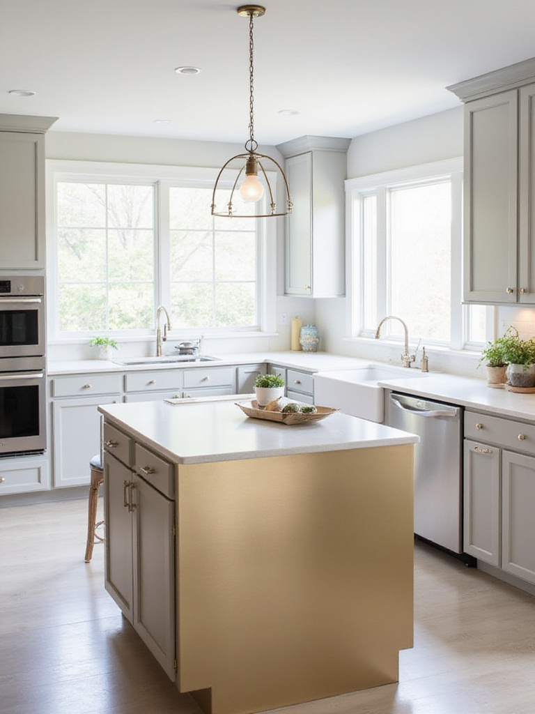
17. Accent Island: Bold Color Focal Point
The kitchen island is an ideal spot for a splash of bold color. As a standalone element, it can showcase vibrant hues that might be overwhelming if applied to all cabinetry. Popular choices include cobalt blue, emerald green, or coral, tailored to your style and kitchen palette.
Contrasting the island with perimeter cabinets creates a layered, curated look that feels personalized. It also allows for easy updates-repainting an island is far less daunting than an entire kitchen.
18. Matte Finish: Sophisticated and Practical Elegance
Matte paint finishes have gained popularity for their soft, non-reflective appearance that adds depth and richness to kitchen surfaces. Unlike glossy paints, matte finishes absorb light, creating a velvety texture that feels modern and timeless.
Matte paints are forgiving of imperfections such as wall texture or minor cabinet dents. Recent advancements have introduced washable matte formulas, combining aesthetic appeal with kitchen-friendly durability.
19. High-Gloss Finish: Luxurious and Reflective Shine
High-gloss paint offers a mirror-like finish that enhances light and creates a luxurious feel. It’s especially effective in small kitchens or those with limited natural light, as it reflects illumination and visually expands the space.
High-gloss surfaces are also easy to clean, making them practical for busy kitchens where fingerprints and splatters are common.
20. Ombre Walls: Artistic Gradient Transitions
Ombre painting techniques create a gradual color transition that adds artistic flair and depth to kitchen walls. This effect can visually alter room proportions, making low ceilings seem taller or narrow spaces feel wider.
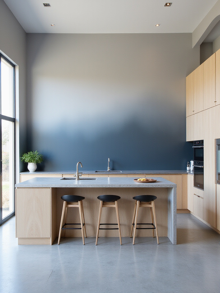
While it requires some technique-such as blending wet paint and using extenders-this DIY-friendly method yields stunning, custom results that often prompt admiration from visitors.
21. Trim and Molding: Defining Details
Often overlooked, trim elements like baseboards, door frames, and window casings play a crucial role in framing your kitchen’s color scheme. Thoughtful trim choices can add architectural interest and polish to your design.
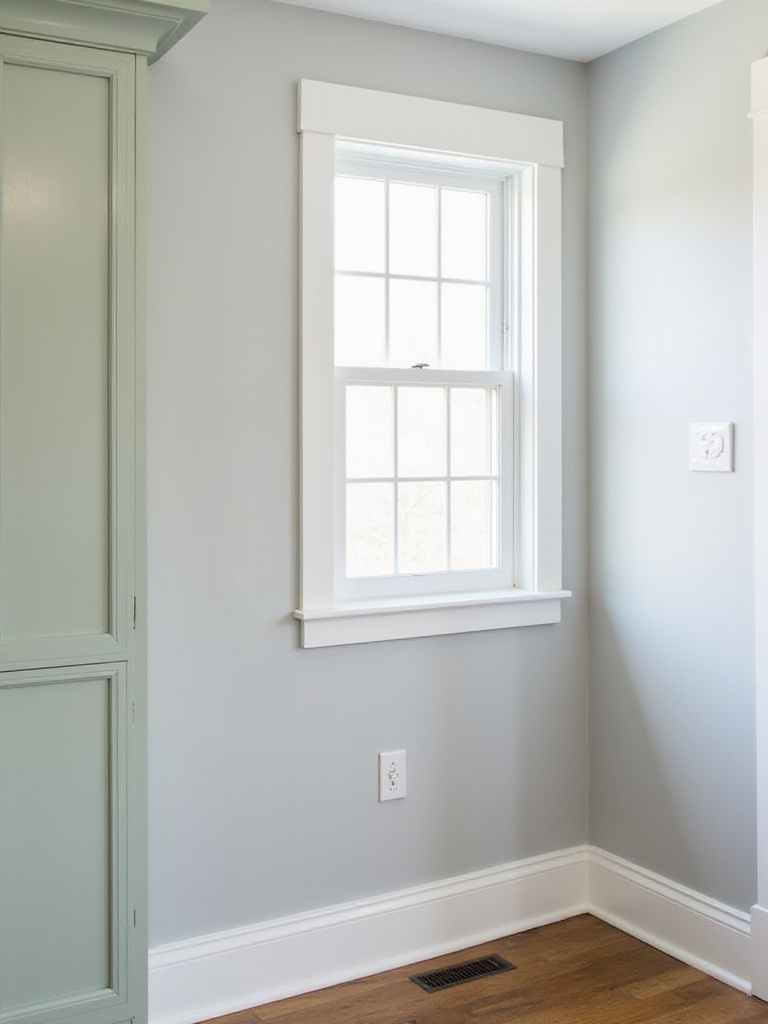
Contrasting trim colors, such as white against colored walls or black trim in modern kitchens, create striking definition. Alternatively, painting trim the same color as walls offers a seamless, sophisticated look that can visually raise ceilings.
Far from cluttering the space, well-chosen trim colors enhance cohesion and intentionality in your kitchen’s palette.
22. Testing Paint Samples: Essential for Perfect Color Selection
One of the most critical steps in choosing kitchen paint is testing samples in your actual space. Lighting conditions dramatically influence how colors appear, and what looks ideal in a store or online may shift once applied to your walls.
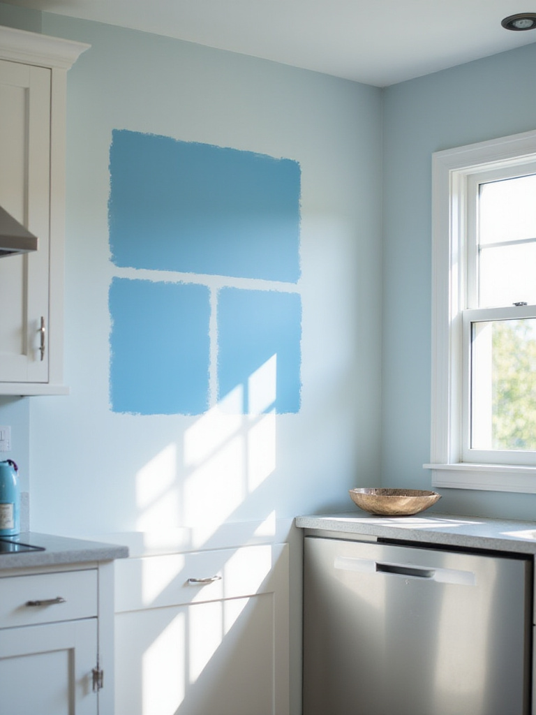
- Apply large swatches (minimum 2’x2′) on multiple walls
- Observe colors at different times of day
- Evaluate under both natural and artificial lighting
- Consider how colors interact with cabinetry, countertops, and flooring
- Live with samples for at least 48 hours before deciding
This process helps avoid costly mistakes and ensures your chosen color harmonizes perfectly with your kitchen’s unique environment.
Conclusion: Crafting Your Dream Kitchen Through Paint
Choosing the right kitchen paint is about more than aesthetics-it’s about shaping a space that reflects your personality and supports your lifestyle. Whether you gravitate toward the timeless purity of white, the bold drama of navy, or the organic calm of sage green, paint remains the most accessible and impactful way to refresh your kitchen.
Focus on selecting colors that bring you joy, complement your existing design elements, and suit your kitchen’s lighting. Take your time experimenting with samples, trust your instincts, and personalize these inspirations to create a kitchen that feels uniquely yours.
Ready to start your transformation? Explore a wide range of [kitchen paint](https://www.amazon.com/s?k=kitchen+paint&tag=blogfizzb-20) options, [cabinet paint](https://www.amazon.com/s?k=cabinet+paint&tag=blogfizzb-20), and [accent wall paint](https://www.amazon.com/s?k=accent+wall+paint&tag=blogfizzb-20) on Amazon to find the perfect shades for your project. Grab your brush and bring your dream kitchen to life!